Sala Sarita Case Study:
Brand Architecture & Creative Direction
Core Challenge
The Clinical Foundation: Manifest Holdings developed a scientifically superior product line consisting of a high-performance nail lacquer, SALA SARITA, offering 8-to-10-day longevity alongside a multivitamin nail protection treatment.
The Identity Gap: Despite six years of meticulous scientific R&D, the venture lacked a cohesive, premium brand story capable of commanding a luxury market position.
The Strategic Mismatch: The founder initially hired a brand agency that developed the logo and identity projecting a transactional, mid-market aesthetic. This low-market visual tone stood in direct conflict with the founder’s vision, objectives, prestigious Madison Avenue address, and its target premium consumer.
Strategic Pivot
Analytical Deep-Dive
D&P shifted the client's focus away from premature tactical execution to define a genuine, high-margin premium market opportunity.
Equity Foundation
We established an intentional roadmap to build the brand's infrastructure slowly and methodically, cultivating awareness and driving sales prior to investing in a wider commercial launch..

Sala Sarita Past Brand ID, Logo and Creative Direction. D&P was hired to refresh the ID and develop the brand architecture and creative direction.
CommunityCultivation
We pivoted to a hyper-targeted B2C strategy. We designed a framework to cultivate brand perception and educate consumers through highly curated, experiential client events at the flagship salon to build deep consumer trust before venturing into wholesale and taking on higher overhead and media costs.
Architecture & Narrative
Brand Diagnostic
Overhauled the core positioning to accurately meet luxury premium market expectations and protect the product's clinical heritage.
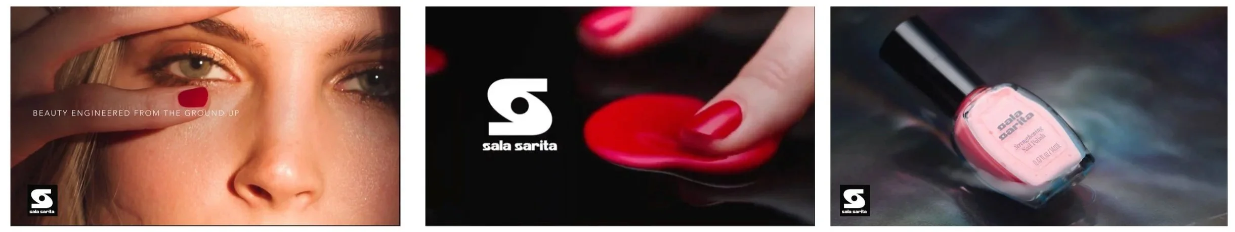
Brand Film
We established an intentional roadmap to build the brand's infrastructure slowly and methodically, cultivating awareness and driving sales prior to investing in a wider commercial launch..
Lifestyle Imagery
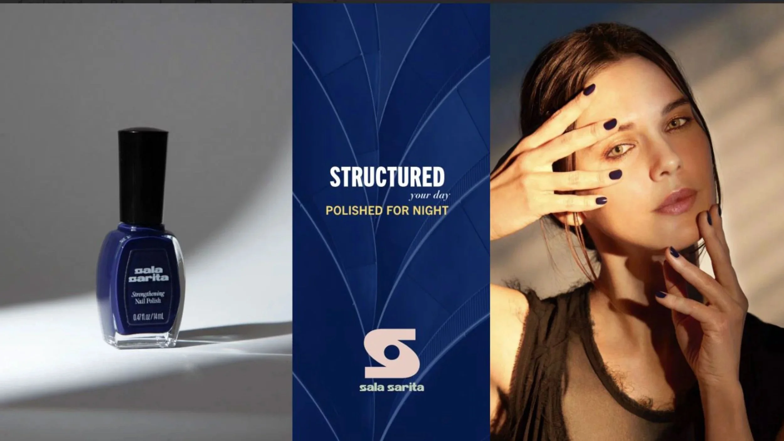
Executed a high-fashion photography campaign capturing the authoritative New York City woman on the go. This asset suite established a timeless, premium visual vocabulary deeply connected to modern culture and community.
Identity Optimization
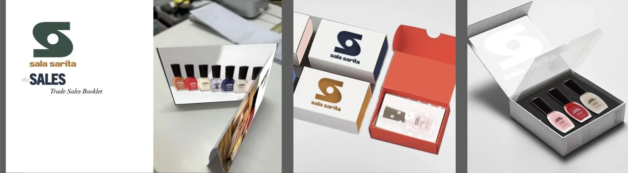
Refined the brand's core typography, created structural luxury packaging concepts, and authored a definitive Identity Standards Guidebook & Brand Concept Book filled with actionable collateral ideas for brand activation
Post Brand ID, Log and Creative Direction
The Evolution: North Star Brand Roadmap
Brand Pillar
Inherited Identity & Strategic Realignment
Positioning
Transactional / Low-Market & Premium Target Market
Visual Tone
Mass-market retail aesthetic & Lifestyle Photography
Storytelling
Fragmented & purely scientific & Cohesive Premium Lifestyle Narrative
Brand Value & Unique Story
Increased Brand Equity & Valuation
Integrated Brand Roadmap: Integrated Digital & Print Ecosystem to expand organically through brand collaboration and partnerships to build consumer awareness and sales.
Beauty That Moves With You.
Identity Refresh & Concepts
Brand Optimization
Implementing typography and a logo refresh to improve legibility while maintaining core DNA.
• Brand Standards Guidebook

BEFORE

AFTER
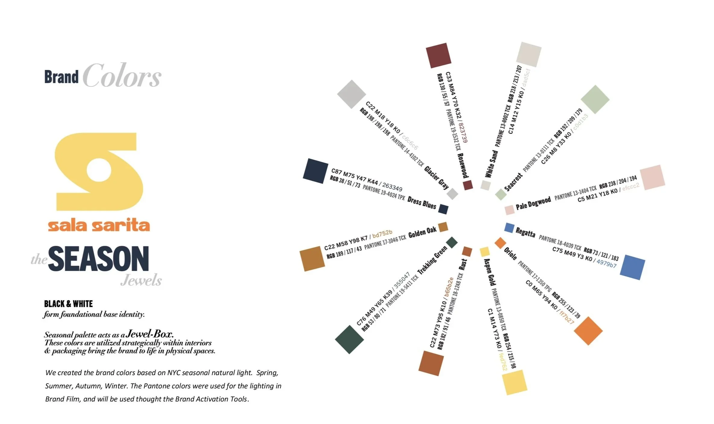
BRAND Colors
Brand Optimization
We created the brand colors based on NYC seasonal natural light. Spring, Summer, Autumn, Winter. The Pantone colors were used for the lighting
Signature

Brand Activation
Website Direction & Assets

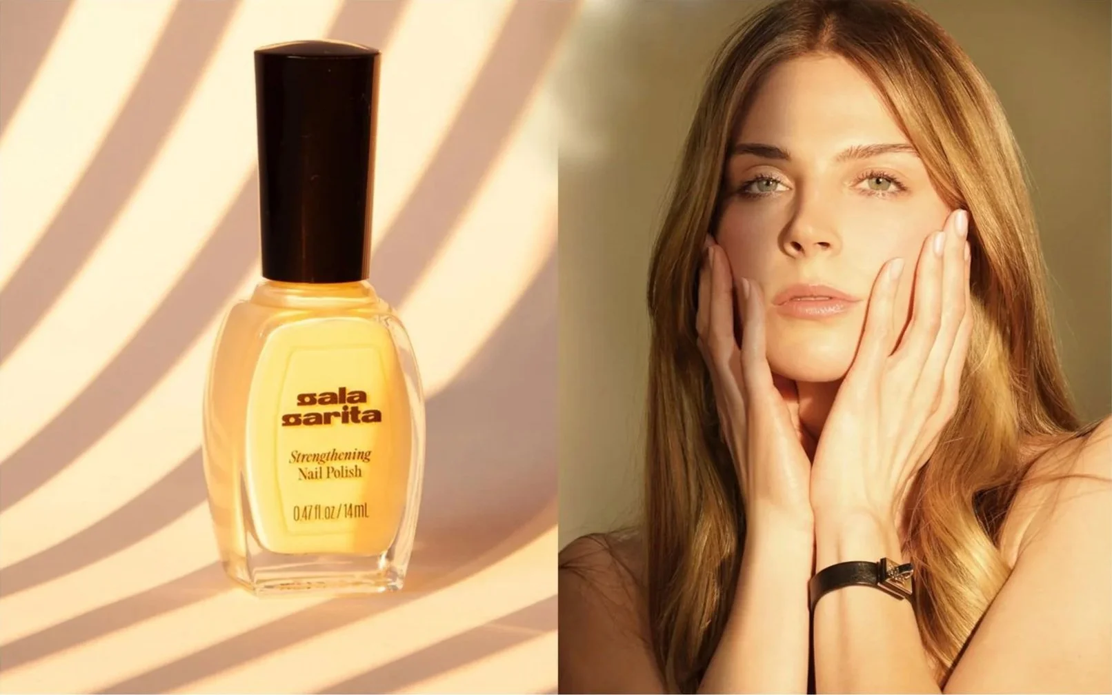
Lifestyle Photography
Lifestyle Photography

Lifestyle Photography

Lifestyle Photography

Lifestyle Photography
Lifestyle Photography